
Lulu's Menu Re-Design
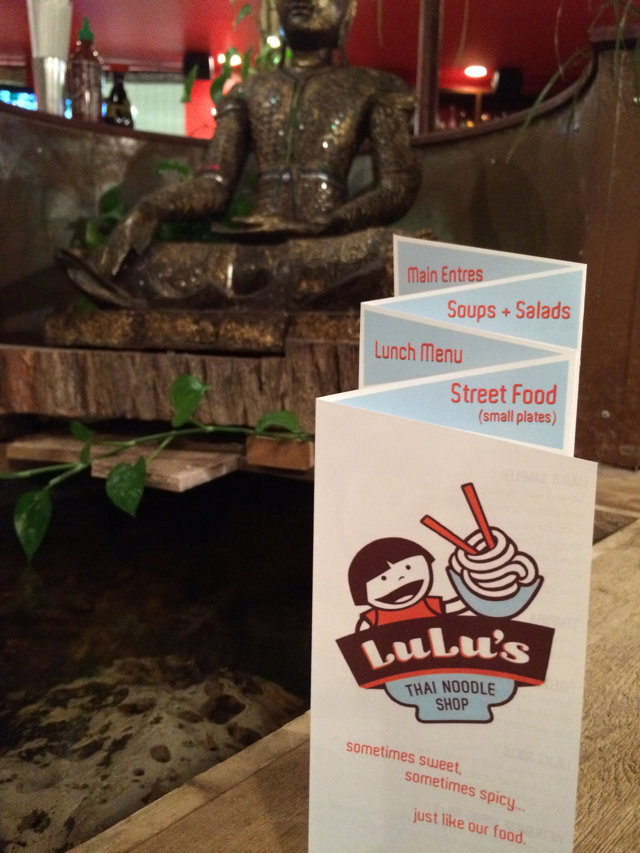
Lulu's Thai Noodle Shop in the Crossroads District of Kansas City, MO is one of my favorite places in town. Not only is the food top notch, but the atmosphere is quirky and fun while classy and stylish. The Lulu's brand communicates pretty clearly what to expect between the colors and the little girl and her noodle bowl which serve as the logo.
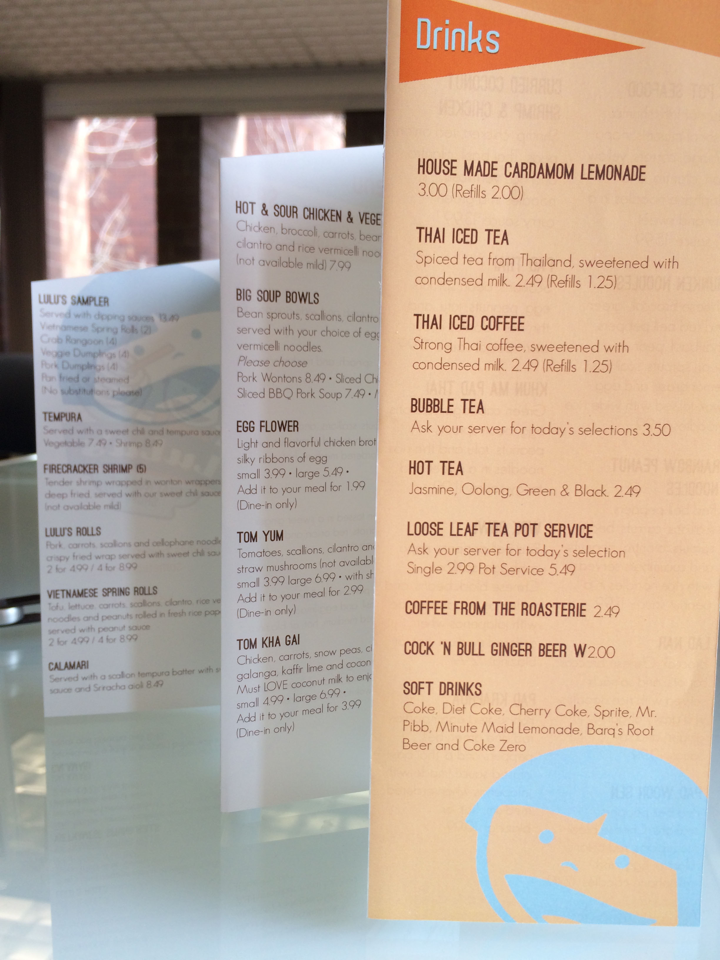
The menu, on the other hand, left a little to be desired. It was designed well, with clean lines and a generally easy readiblity, but it left a little to be desired in terms of fun. My goal was to maintain all of the positive qualities of the original menu design while ramping up the fun and better demonstrating the brand.
I designed the fold format to be at an angle, and each fold opens to reveal a different section of the menu. Because it was deisgned on a diagonal, the folds allow for a label to stand at the top of each section. Some geometric shapes - each one a tint of one of the brand colors - were also incorporated to liven up the layout.